Saturn: From class timer to calendar

A case study in turning a beloved single-purpose utility for high-school students into a calendar platform teenagers actually use.

Role
Lead Designer
Industry
Social
Designs circa
2022–2025
Employment type
Full-time
Exit
Acquired by Snap

Saturn: From class timer to calendar

A case study in turning a beloved single-purpose utility for high-school students into a calendar platform teenagers actually use.

Role
Lead Designer
Industry
Social
Designs circa
2022–2025
Employment type
Full-time
Exit
Acquired by Snap

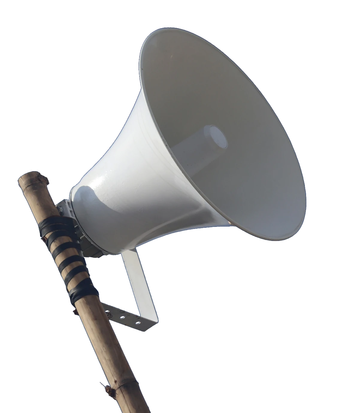
Saturn exists because of this.

A school megaphone on a pole

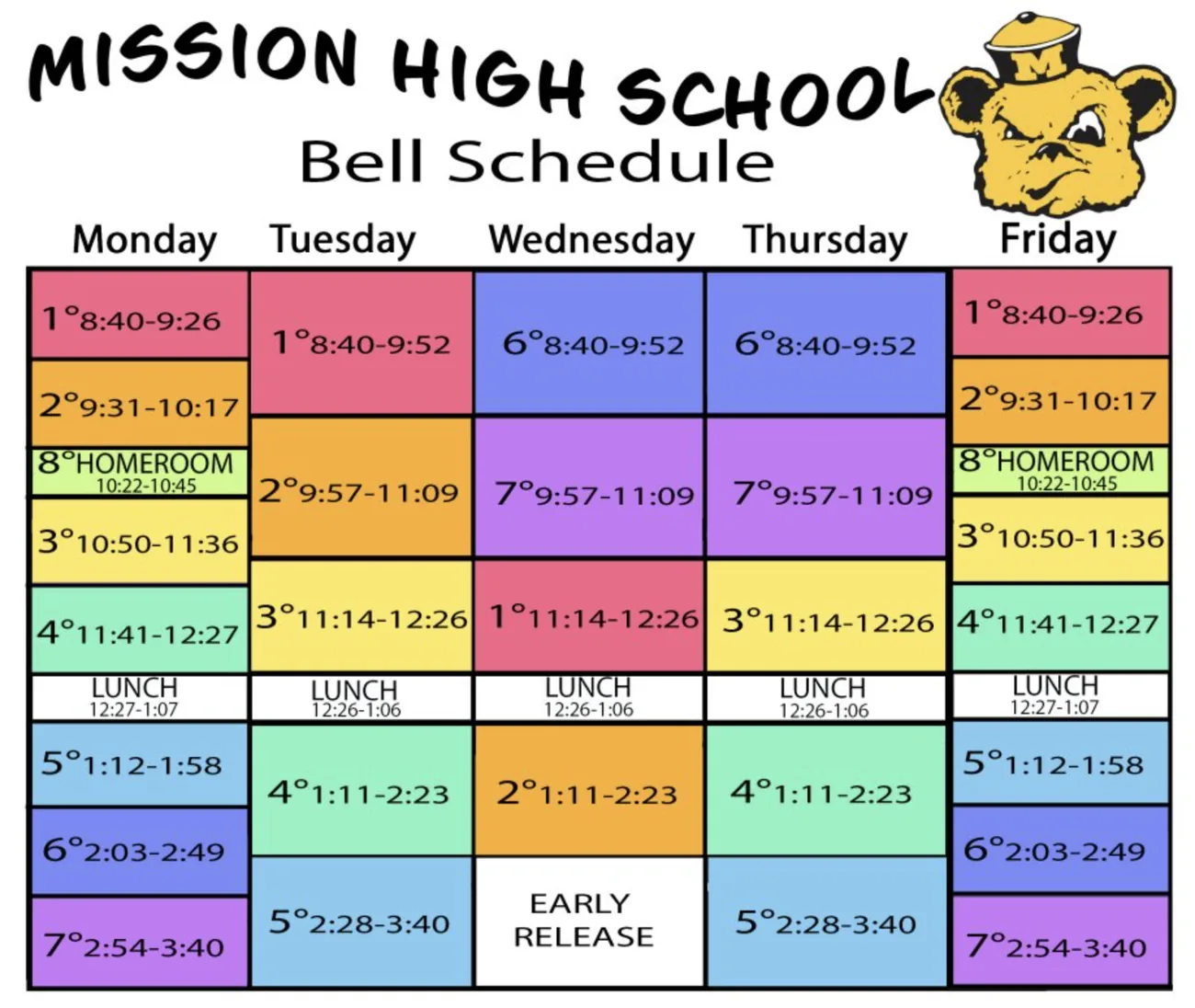
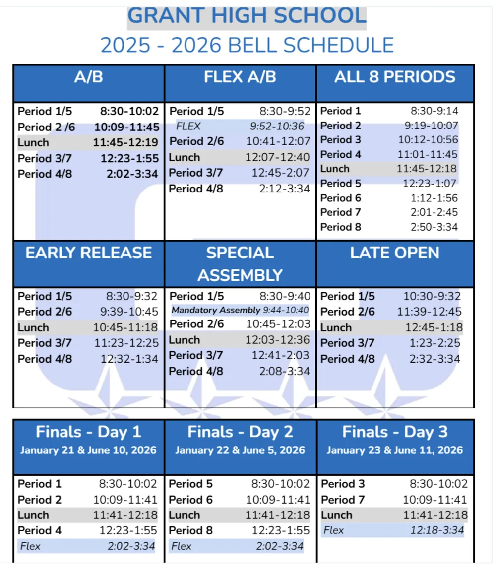
Behold the American high school schedule.

It’s a mess of conditional class order, rotating bell schedules, early releases and assemblies. Kids never know what today looks like.
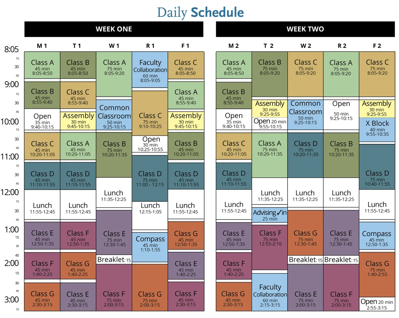
A colour-coded two-week daily schedule
Grant High School’s 2025–26 bell schedule
Mission High School’s weekly bell schedule
before me

Saturn solved one thing, super well.

Enter your school and classes once, and the app tells you what your schedule is today and how many minutes are left. That simple feature made it a viral back-to-school app, and a venture-backed company.

Investors

  • General Catalyst
  • Insight Partners
  • Coatue
  • Bezos Expeditions
  • Marc Benioff
  • Robert Downey Jr.
  • Ashton Kutcher
  • and more

What was working?

  • Onboarding was the flywheel
  • Moat was proprietary HS schedule data
  • Timer is retentive — high % of DAU, WAU
  • Class schedule felt like ‘magic’
  • Reliable growth moment every year
  • Ambassador program for research and evangelization
  • “I love this app!”

Tap the arrow, or the people icon

But, problems were lying in wait.

Interviews with students revealed the many reasons the app didn’t grow most of year. Here are some of the quotes I uncovered.
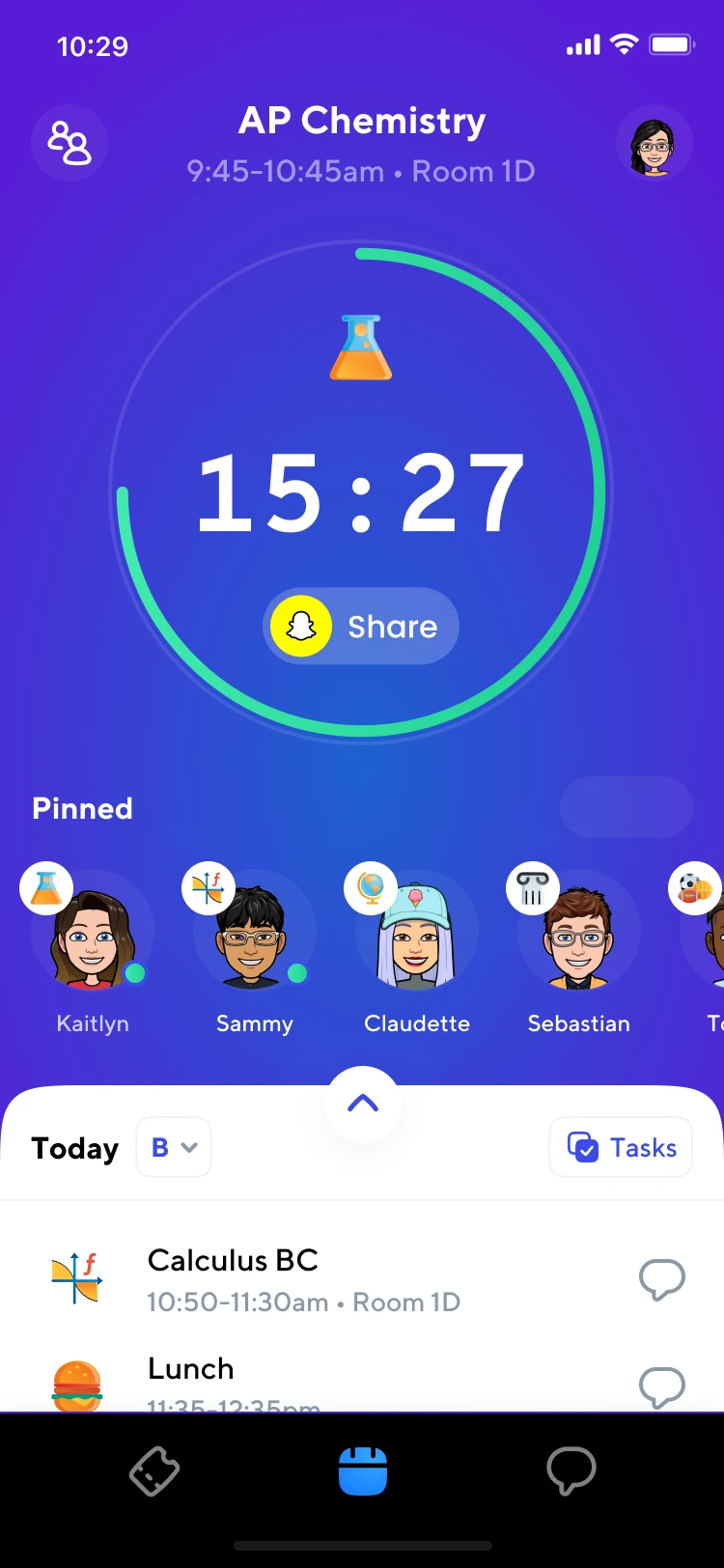
Saturn’s home screen before the redesign: the class timer, pinned friends and the schedule sheet

School directory

Class detail page

Add a classmate

Correct schedule

Events/Parties

Profile: My classes
& friends

Compare Schedules

Homework

Chat

A whole world of features was hiding in these entry points.

The big timer was Saturn’s greatest success and also its handcuffs. Its primacy in the UI stymied any other feature from becoming the next big growth driver.

Custom sheet was prone to bugs

Banners became noise

Incentive to add classes after onboarding was low

First-time user experience was under considered.

Onboarding was very effective, but if users didn’t follow the happy path they were left directionless once in the primary experience.

Also, non-standard UI conventions were holding the app back from evolving to its next phase, such as a custom sheet that required dragging, vertical scroll and horizontal swiping.

What guided my thinking?

With the benefit of fresh eyes, and aided by user interviews, I collated my thoughts in the following ways.

This is not a “calendar” app

User base has never used a calendar before

Missing opportunities for growth in social connection/​behaviors

Sports? Clubs? Users schedules are “dead”

Calendars/​events are inherently complicated objects to create/​control

Competing with other productivity tools, mandated or discovered

Eventually, most kids can remember their schedule. The need to check the bell schedule never dissipates.

The Timer is the primary utility driving all usage of the app after October 1st.

Users who had at least one friend on the app, and used it to compare schedules, were higher retained.

Most students are busy after school (sports, clubs) but they “just remember”. Are we a hammer looking for a nail?

Tapping away from the homepage is rare – no amount of red flags or banners or notifications was helping.

Help more first-time users get fully set up?

Provide the right level of calendaring complexity for this user base?

Create more utility in having friends in the app?

Harness the power of a school-wide network while maintaining trust and safety?

Make checking and maintaining your schedule a daily habit?

Increase social behavior but not be included in schools’ social media ban?

Tap a stack

My first attempt that shipped

Live for the last 2 months of the 21–22 school year, this version attempted to make Calendar the star.
Kids missed the big timer, and the onboarding question wasn’t solved.
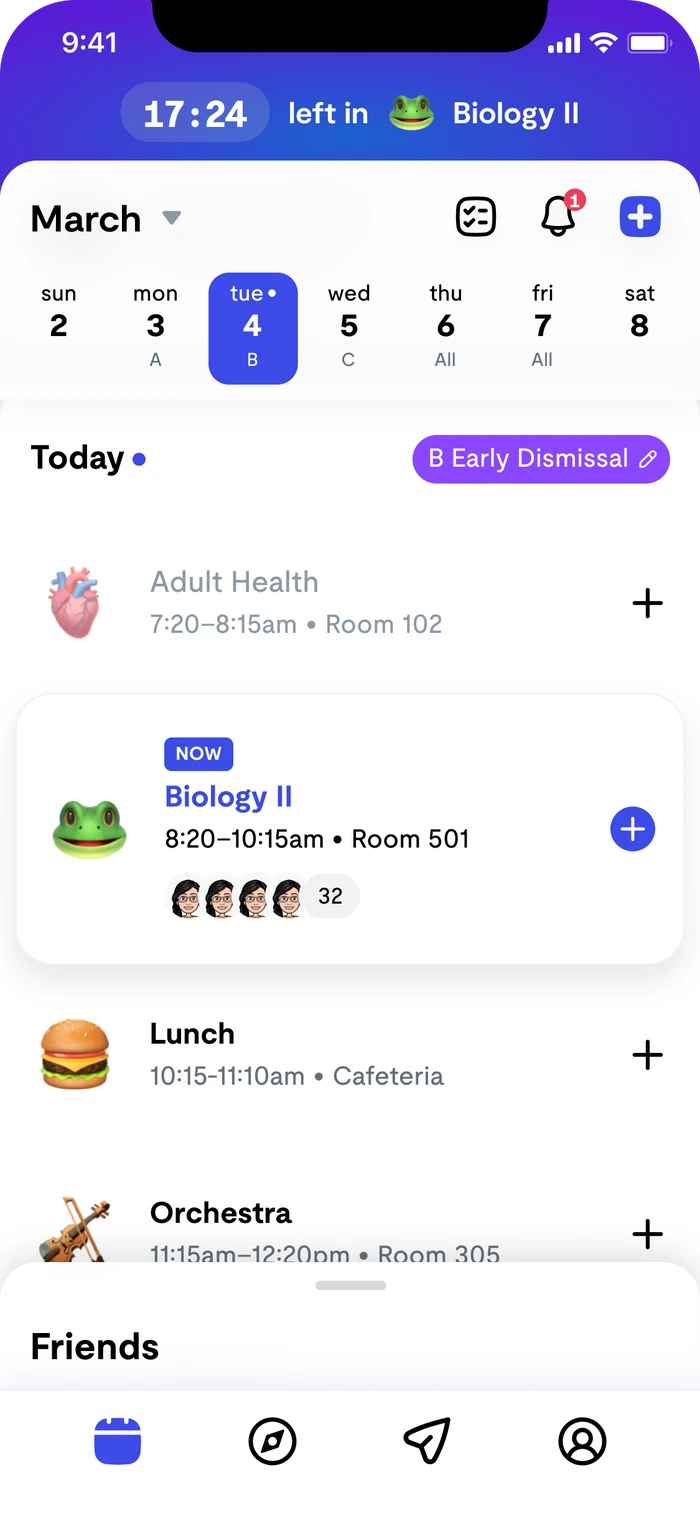
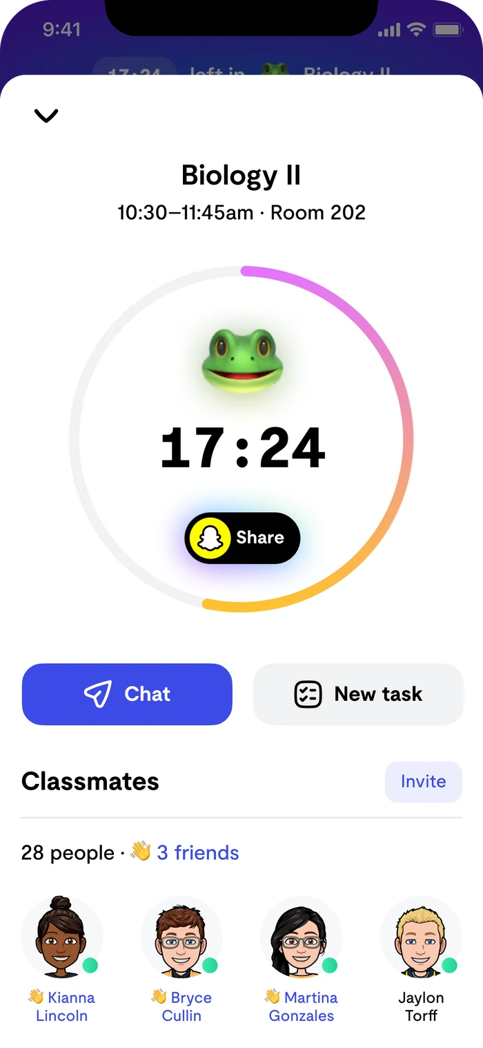
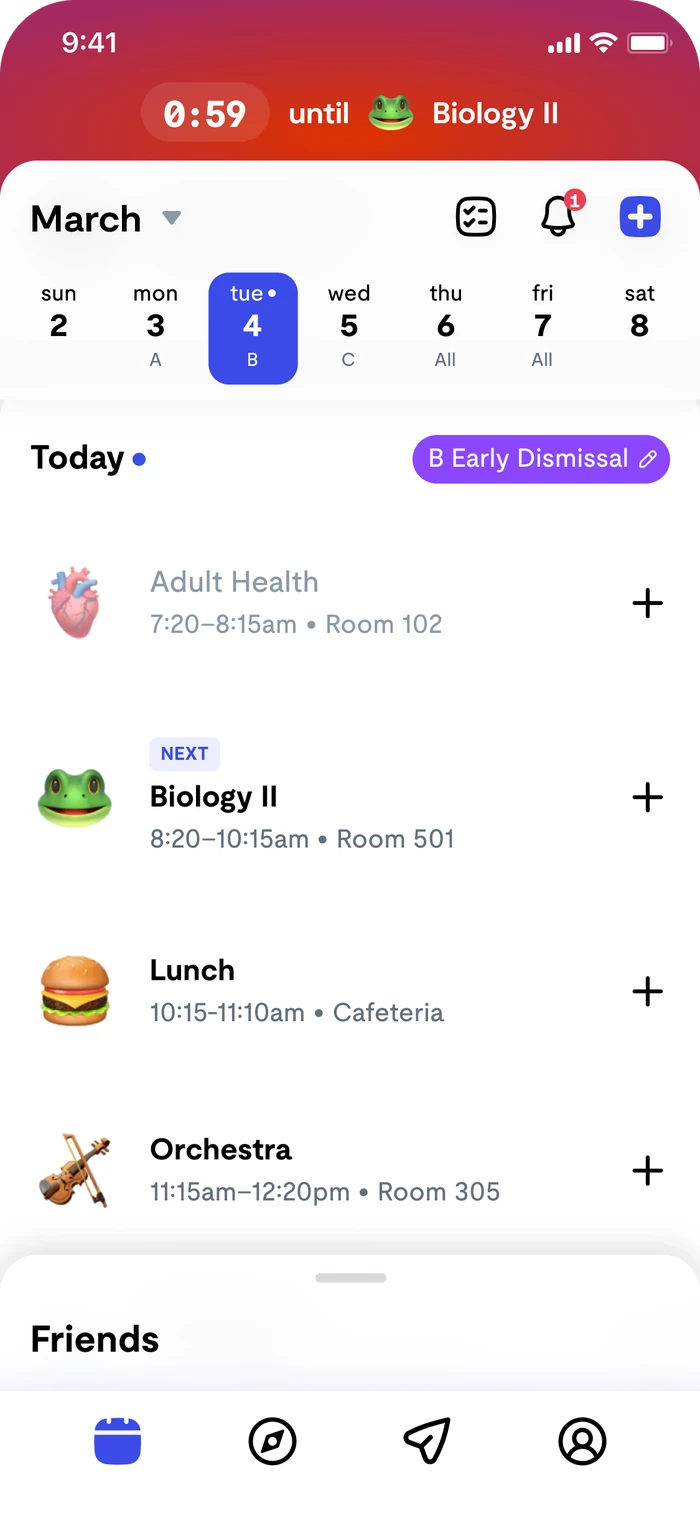
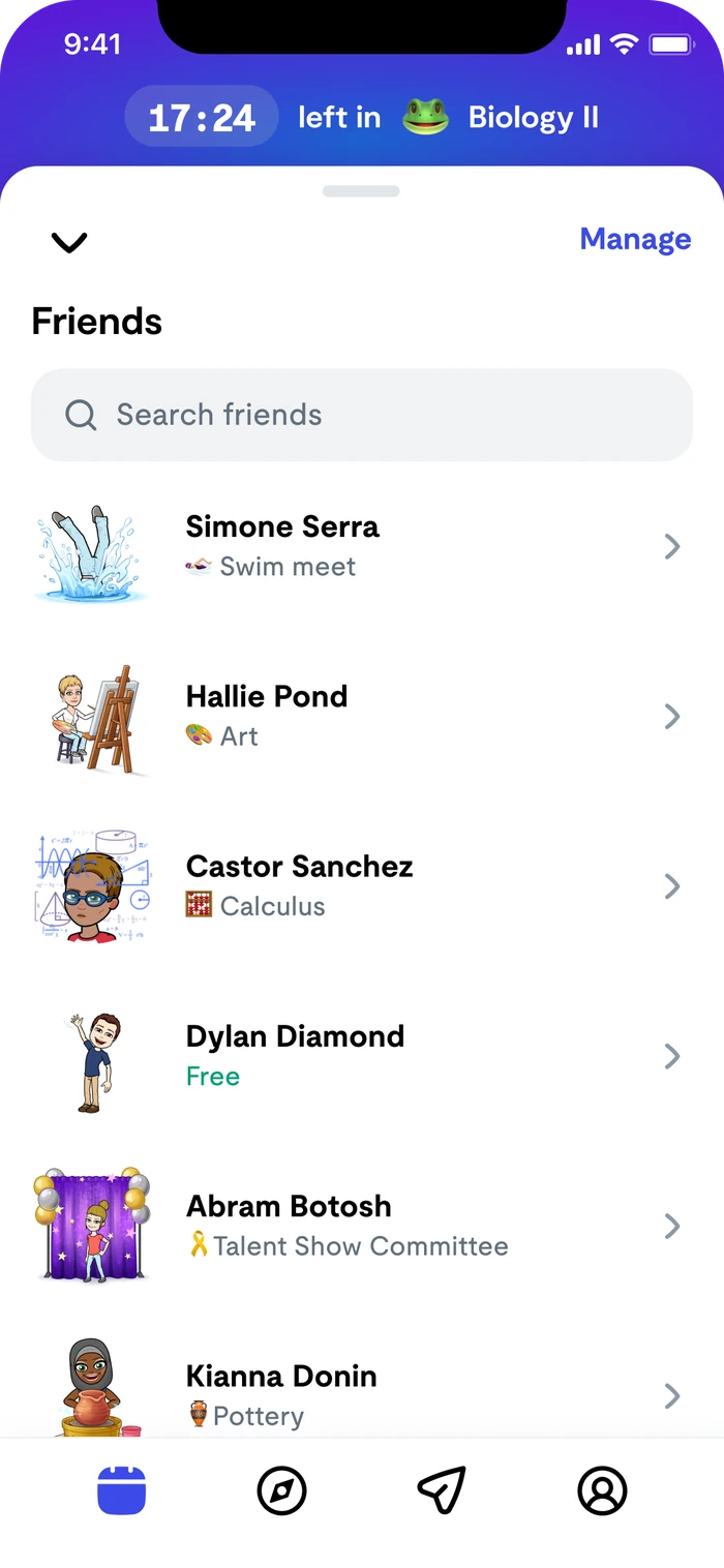
Calendar-first home during class, with the current class highlightedClass detail with the big timer ring, chat, new task and classmatesThe red final-minute state: 0:59 until the next classFriends list showing what each friend is doing now

The homepage needed a fresh new start.

Users wanted…

  • to know what bell schedule today and tomorrow are, at a glance
  • to know how much time until class ends or starts
  • know what class their friend is in now/next
  • Customization with school color
  • Emojis?

Saturn wanted…

  • more reasons to invite users to the platform (you MUST be my friend on Saturn)
  • Increase usage after school
  • a real calendar that can display our proprietary schedule data AND external .ics files
  • …Emojis???
my pitch

Separate calendar from timer, creating the “Now Tab.”

I proposed a new home tab that could shape-shift, in the course of one summer, from an onboarding page, to an excitement-building page, to the time-tracking, schedule-knowing hub Saturn was known for.

Metrics I wanted to move

  • Setup completion: students who add every class
  • Sessions that touch something other than the timer
  • Students with at least one friend on Saturn
  • Opens after October 1st, when the novelty wears off

Why this design?

Experimentation

The product team wanted to try lots of features to find new avenues for growth. We needed an interface that was adaptable for experimentation.

Calendar hadn’t earned it

Calendar was unproven as a feature, and inherently complicated. To reach parity or even table stakes with others, it needed its own space to grow.
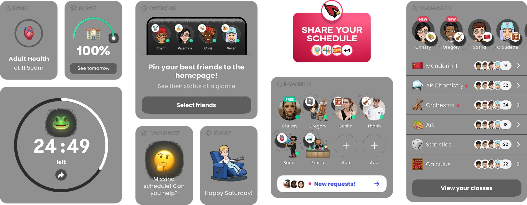
The Now tab’s modular widgets: later, today, the class timer, favorites, tomorrow, share your schedule, and classmates

Back-to-School 2022: the biggest season yet.

The Now tab shipped in August alongside the onboarding-as-home flow.

0k100k200k300k7/248/78/219/49/18 337k · 9/6 273k · 9/28 20222021Daily active users, back-to-school

DAU peaked at 337k on 9/6, against a 2021 peak of about 37k: roughly 9× year over year. It was still at 275k on 9/28.

Setup completion rose to 72%, and for the first time users regularly touched features other than the timer.

D30 retention: 31% vs 18% in SY21
WAU peak: 1.1M

results

After-school remained unsolved.

A product disagreement about what belonged there, plus an over-committed engineering roadmap, left the most valuable real estate in the app fallow from 3pm to 8am.

Also, students reported loving the new design but said things like, “I do wish I could see my whole schedule though” 🤦‍♀️😑

I designed the new Calendar tab concurrently.

the reframe

Kids who “just remember” still needed a calendar — just not for classes.

Everything a student can’t “just remember” involves someone else’s time. So the calendar’s reason to exist would be friends.

design principles

Why do all calendars look the same?

Before drawing anything, I wrote down why the category converges, so we’d know which conventions to keep and which we could break.

Device size
Small screen, big data.
Density
A full day, legible at a glance.
Both axes are taken
Y is time, X is dates.
Occlusion
Overlapping events are the hardest problem.
Where we could differ
Bell schedules, friends, and “now.”
the design

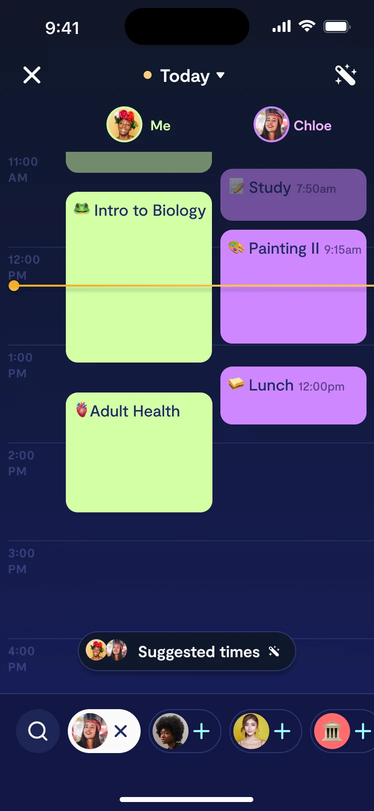
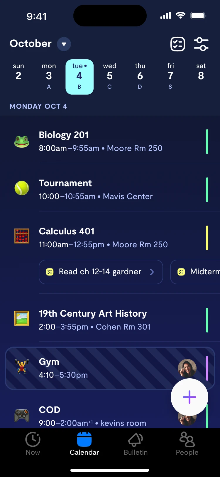
A real calendar, without losing the schedule view.

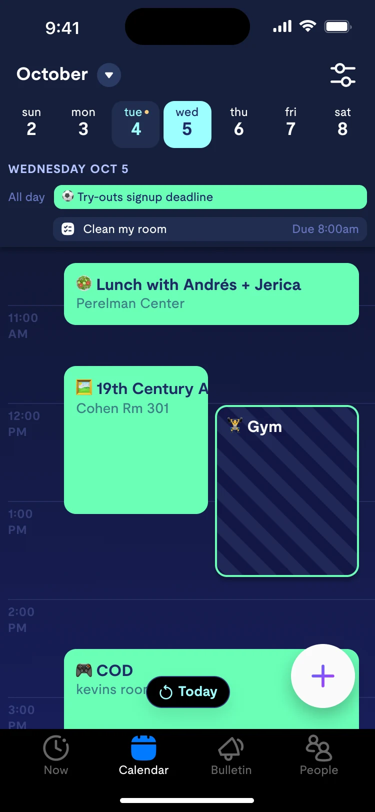
I kept the list-style schedule view as the default, the habit we already had, and added a true day view one tap away. Classes stayed first-class objects, and we finally shipped dark mode, our most-requested feature.

Day view: 41% of weekly calendar users
distribution

Meet students where their time already lives.

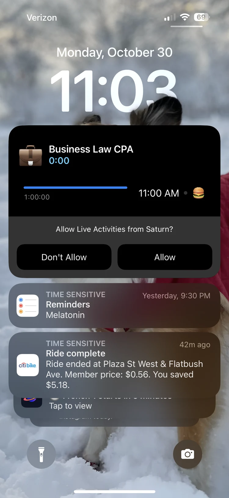
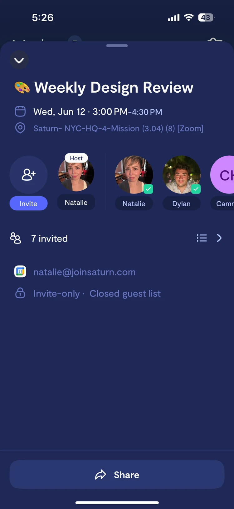
Google Calendar sync meant we stopped competing with GCal and started containing it. Live Activities put the class timer on the Lock Screen and Dynamic Island: what students want most, with zero taps.

+150%app opens after Live Activities launched
what we learned

The metrics moved. The identity didn’t.

Setup completion and early retention rose, yet students still called Saturn “the timer app.” We had built two good products that didn’t know they were one.

How might we marry the Now tab and the calendar, and tell one coherent story?

the unlock

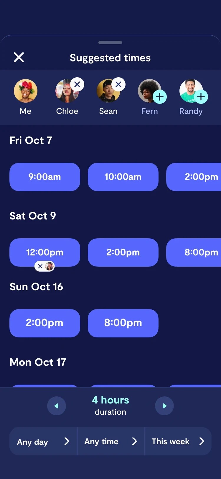
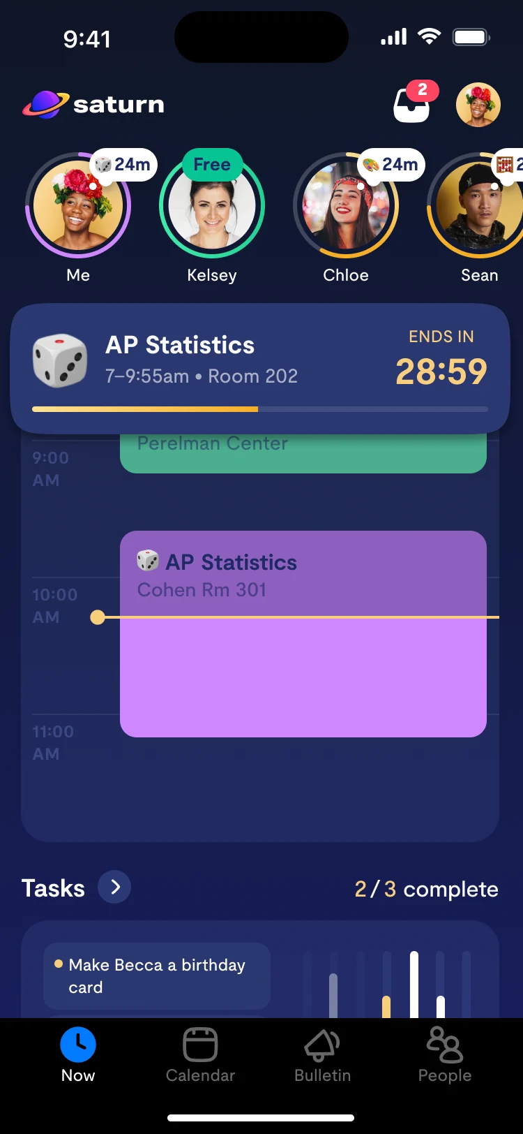
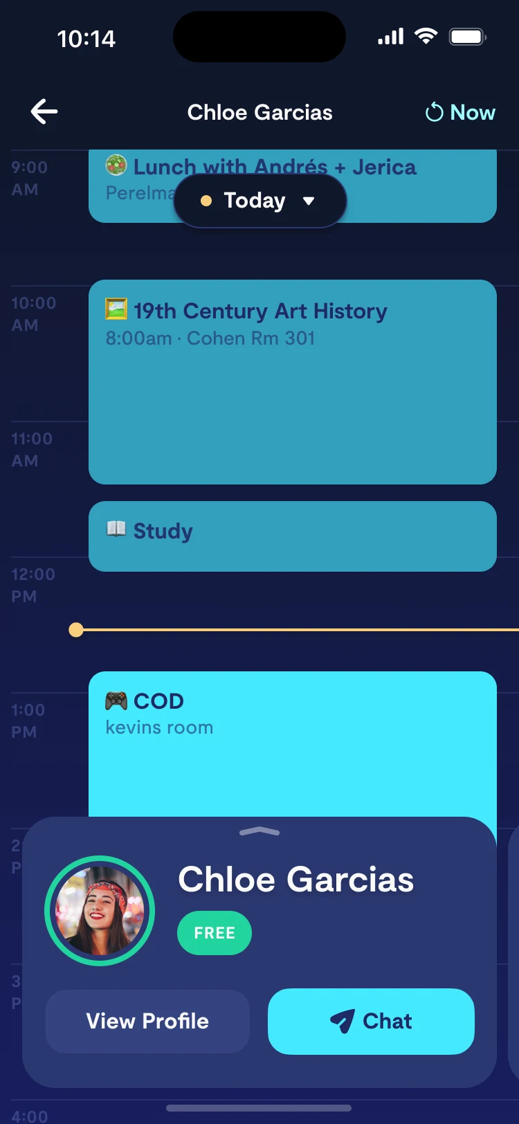
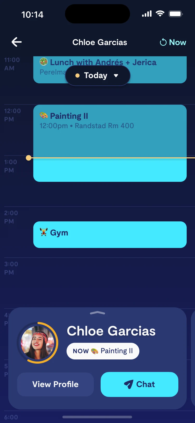
Day view unlocked the feature Saturn was always meant to have: Calendar Compare.

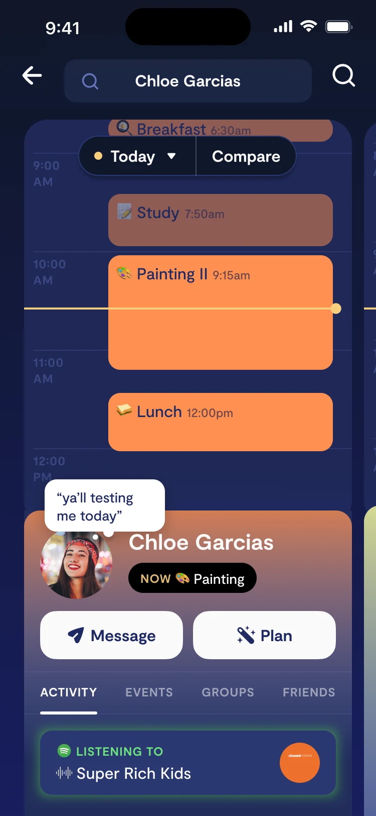
With a real, time-based day for every student, we could lay two side by side. Compare answers the question students actually ask each other: “when are you free?”
craft

Designing Compare for the awkward states.

Shared free time is the hero. Overlap recedes but never hides. A friend’s classes stay legible without revealing more than they chose to share.
result

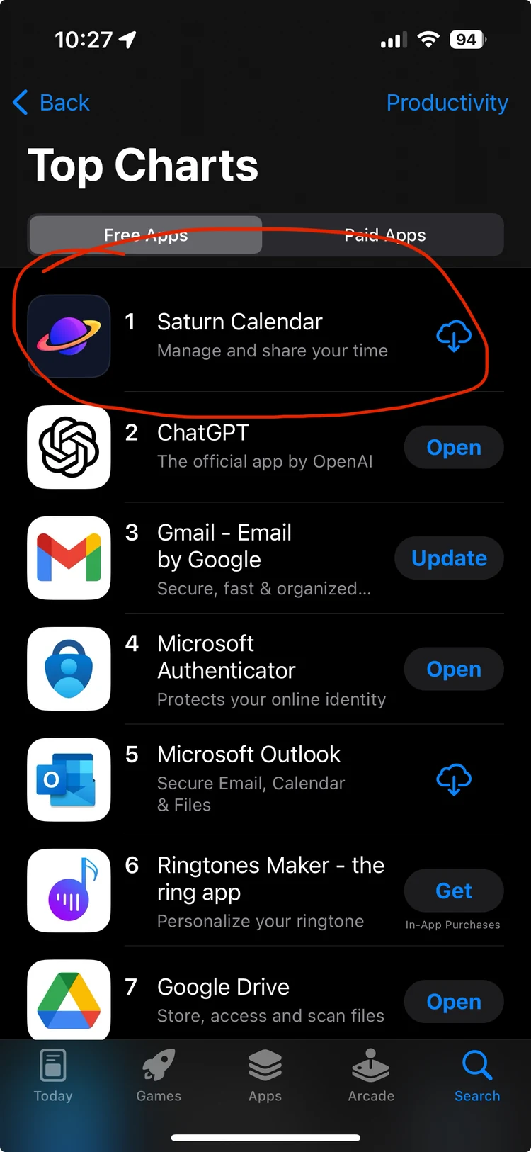
Fall 2024: #1 Productivity app on the App Store.

Ahead of ChatGPT, Gmail and Microsoft during back-to-school. Compare and Live Activities were the features students cited most in reviews.

610kpeak DAU, fall 2024

62%of students with ≥1 friend

4.8★App Store rating
the next ceiling

An empty calendar is useless.

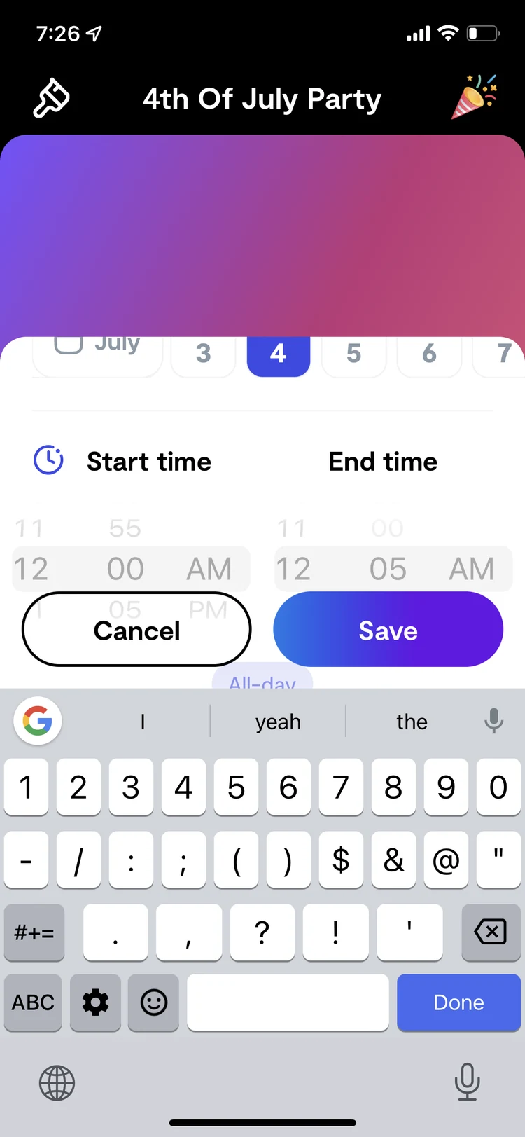
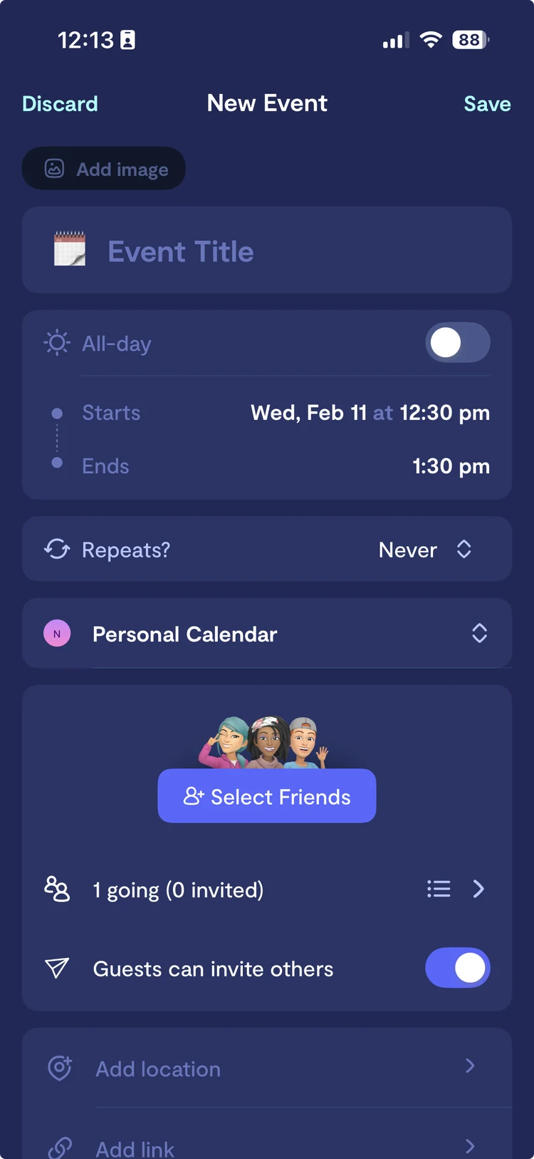
Compare exposed the next constraint: outside of classes, most calendars were nearly empty. First I removed friction, rebuilding event creation to be title-first and invite-first. Students care who’s going, not the end time.
the ai bet

Could students just say what they’re doing, and let Saturn do the rest?

“Chat to create” sits where the timer lives: rattle off “soccer tues 4pm, chem test friday” and an LLM turns it into events, with friends attached. Before scaling it, I pushed us to answer: habit or novelty? And what does a wrong parse cost?

18% of new events created via chat

concept → reality

From prototype to production.

I prototyped AI capture end to end, then worked with engineering to cut it down to what we could ship and measure. The conversational home and the Ringo onboarding were cut; chat-to-create on the calendar shipped.

breadth

Reasons to open Saturn on an empty day.

Alongside the roadmap, I ran a stream of lightweight, shareable concepts aimed at daily habit. Digest is a morning story: your greeting, the weather, today’s bell schedule, your day, what friends are up to, and how the school is feeling.

Questions?

1 / 1 ← → or space
Scroll